Realigning a national civic-tech nonprofit.
Democracy Works | Civic Tech | Brand Identity & Strategy
Democracy Works is a nonpartisan nonprofit that builds the essential election tools and data that most Americans rely on without ever knowing it.
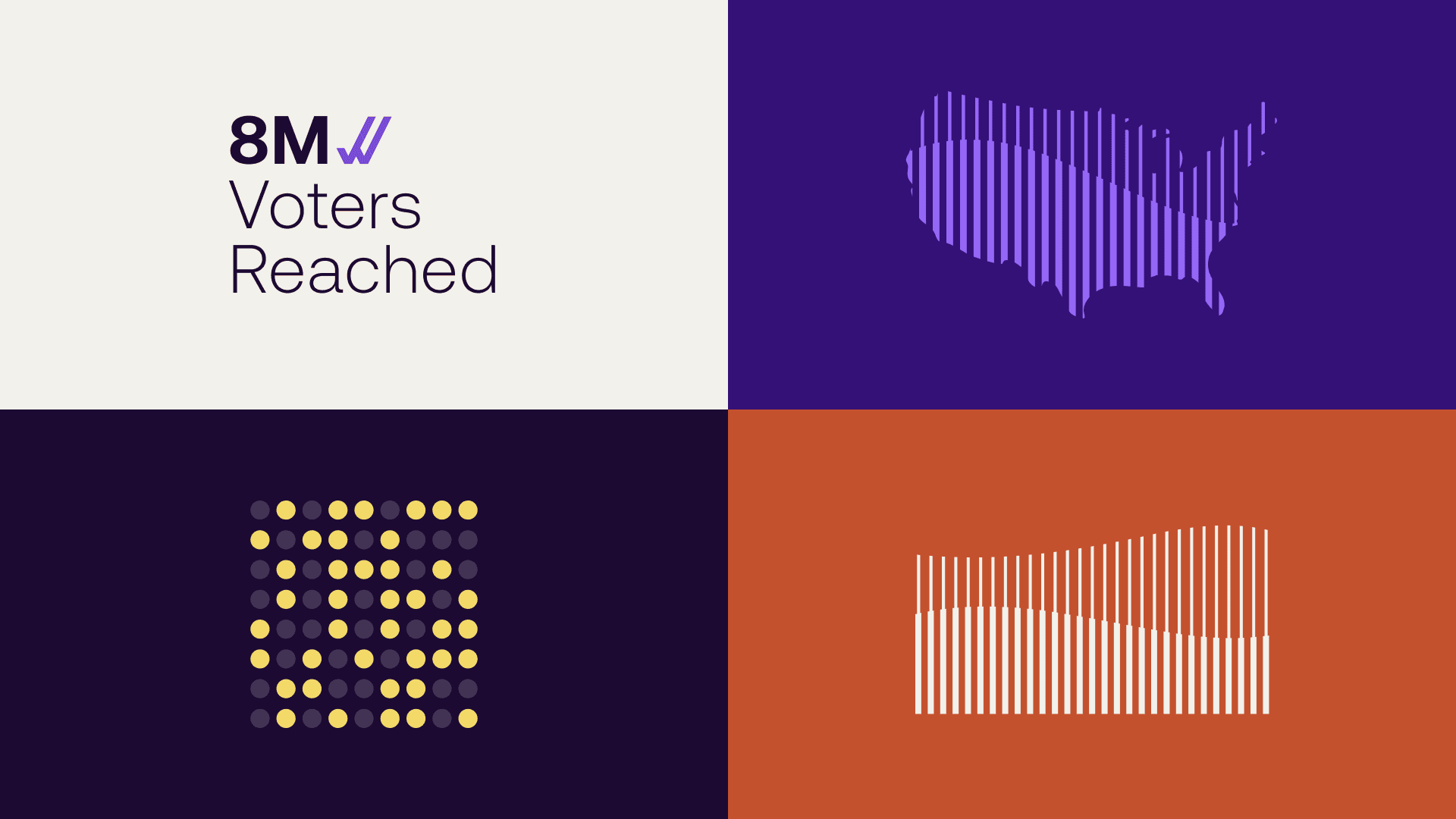
If you’ve ever Googled “where do I vote” or have seen your polling info pop up in Facebook or TikTok, you’ve likely used their data. Every election, their tools reach millions of voters across more than 120,000 polling places and over 3,000 elections nationwide.
With the 2026 election cycle approaching and new leadership in play, we partnered with their team to close the gap between the scale of the work and the brand carrying it.
Reach without recognition.
Democracy Works had a problem most nonprofits wouldn’t mind having. Their impact was everywhere, but their brand was unknown.
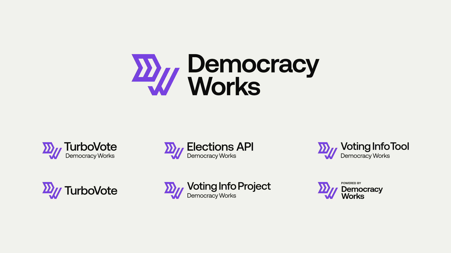
Most people recognized their products (TurboVote and Voting Information Tool) without ever knowing the parent organization behind them. Under the surface was a question leadership had been circling for years. Should Democracy Works be the main brand driver, or a quiet operator behind a portfolio of better-known tools?
Product teams had built real equity in the sub-brands. The parent organization had built the infrastructure. But the relationship between them was unclear, and the identity had grown sprawling and dated.
Closing the gap.
We started, as we always do, with listening. To leadership, to staff, to the partners already trusting Democracy Works with their data. The organization was aligned internally and respected externally, but the brand just wasn’t carrying the full story.
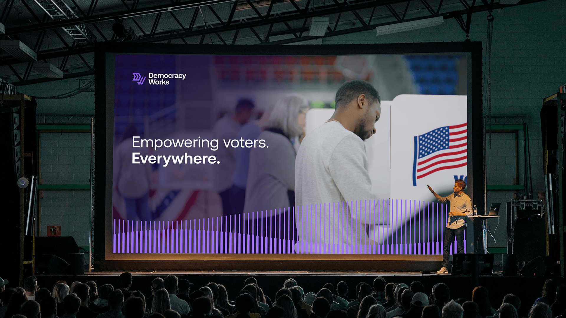
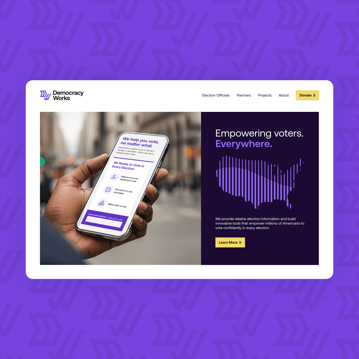
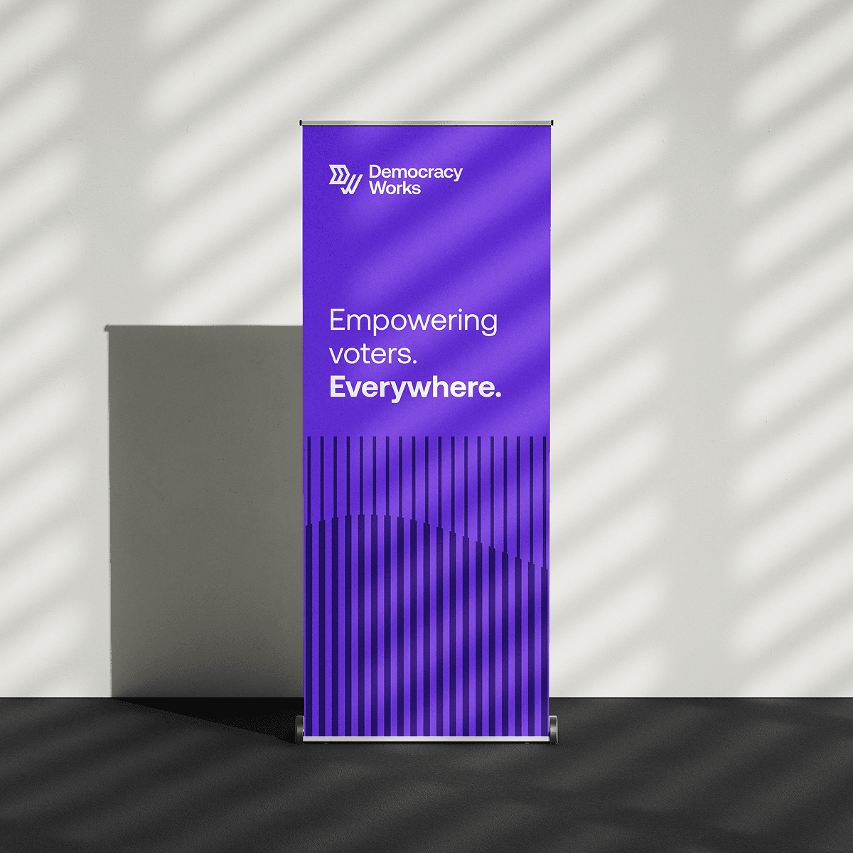
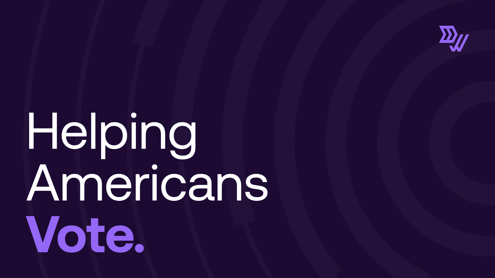
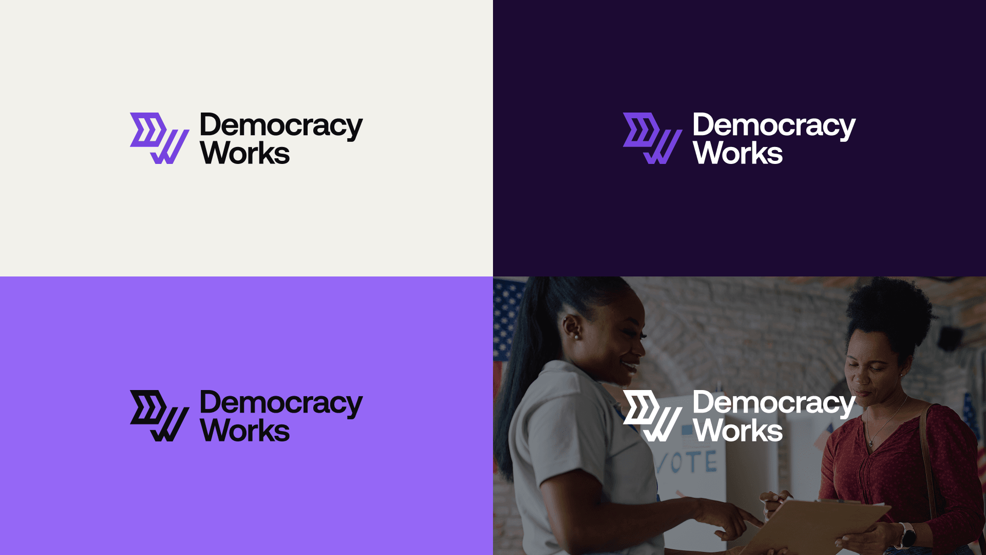
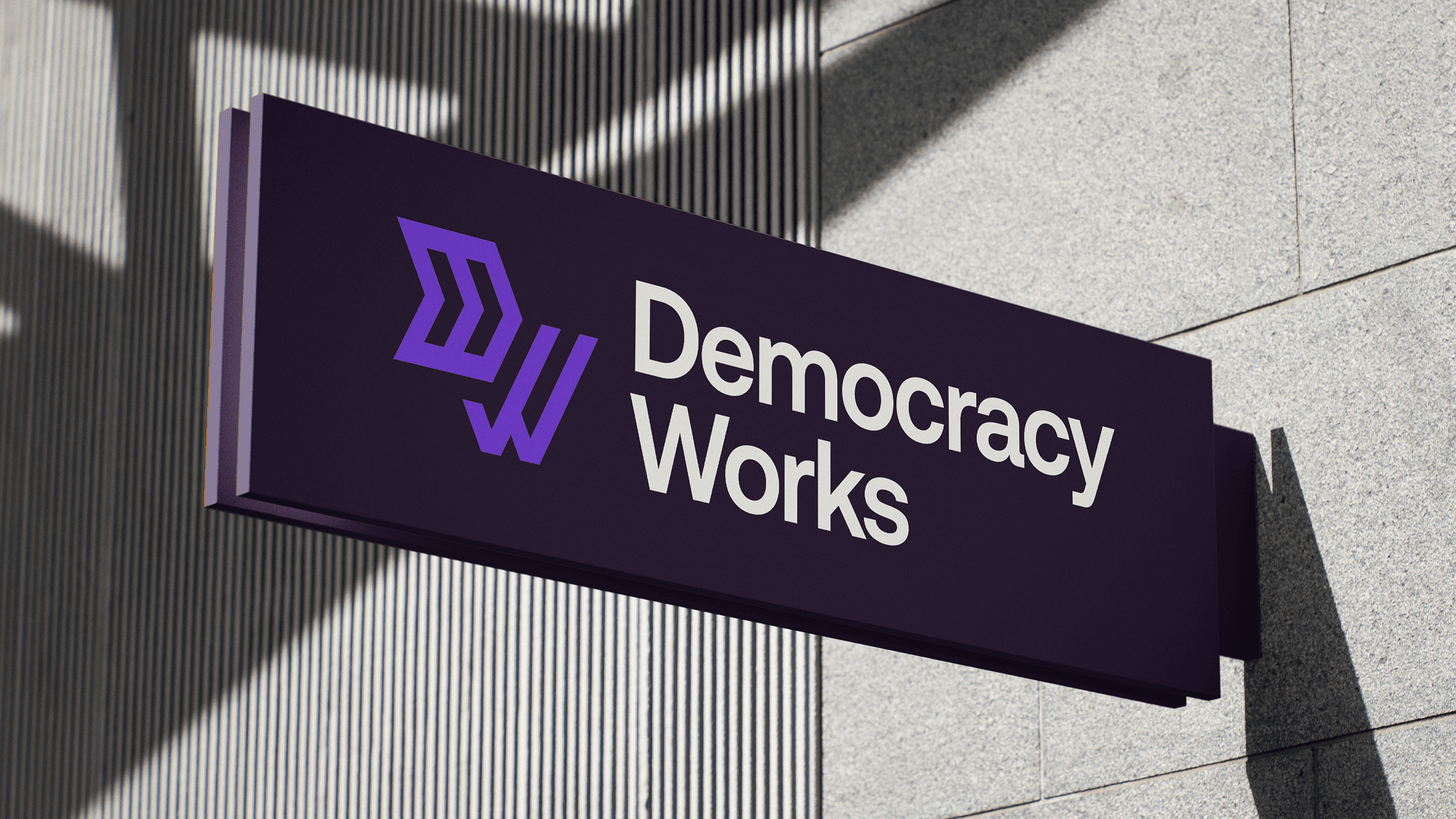
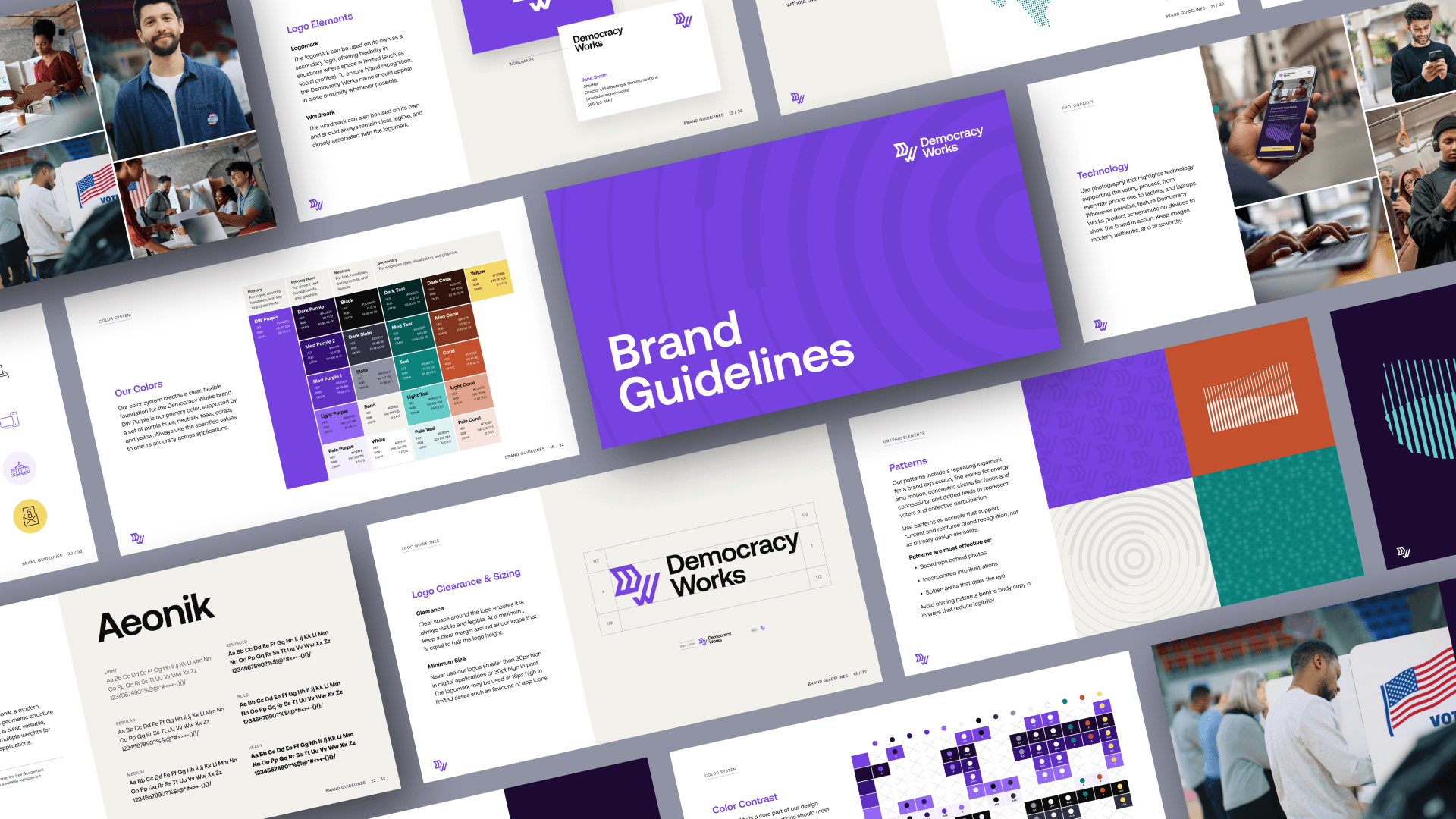
From there, three strategic moves. A simpler way for the whole team to talk about the work, grounded in clear, succinct language anyone can understand. A phased brand architecture that settled the parent-vs-operator question and gave every product a home under Democracy Works. And finally, a logo suite and visual system designed to feel like national infrastructure: confident, trusted, tech-forward, with none of the partisan cues that dominate the category.
The individual pieces stopped feeling like separate entities, and started feeling like one organization showing up at full scale.
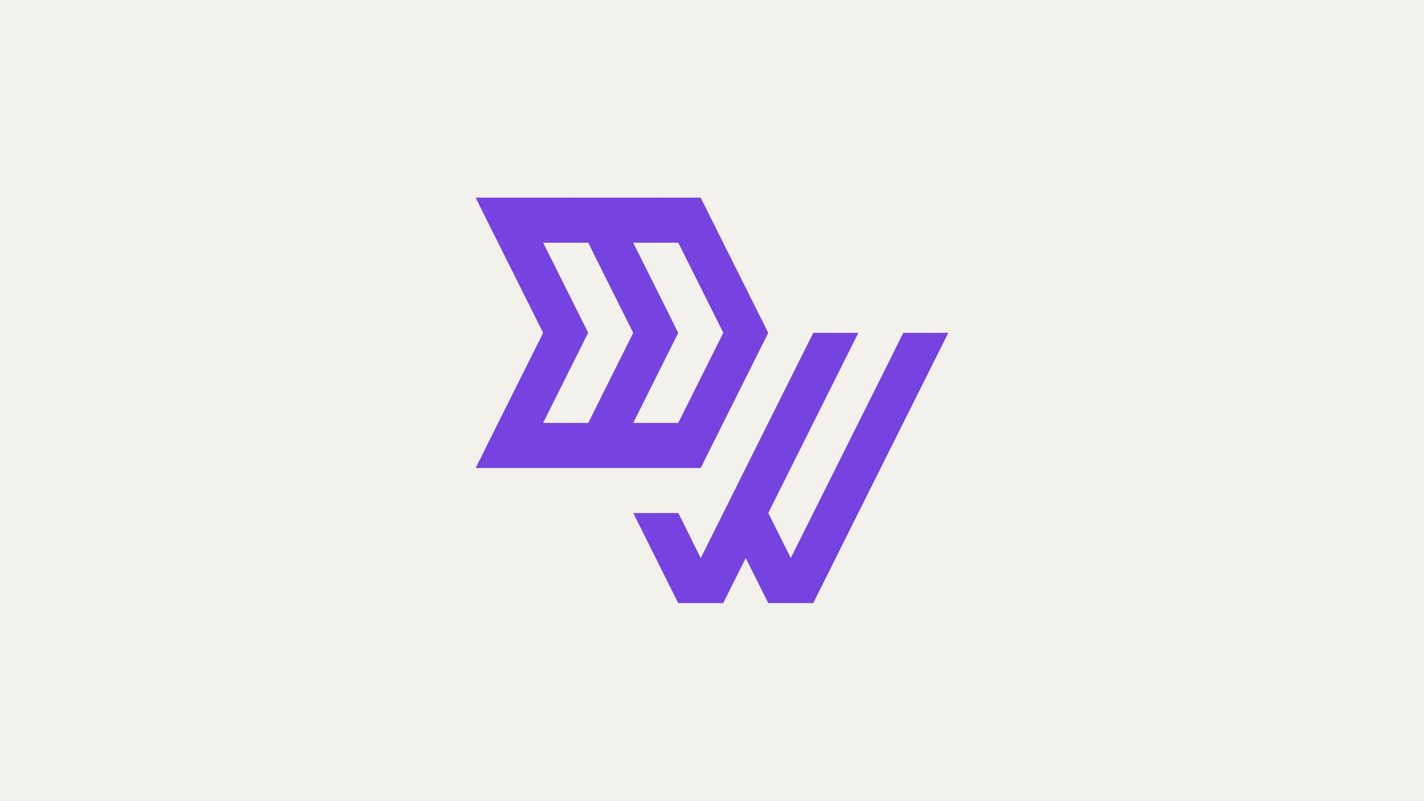
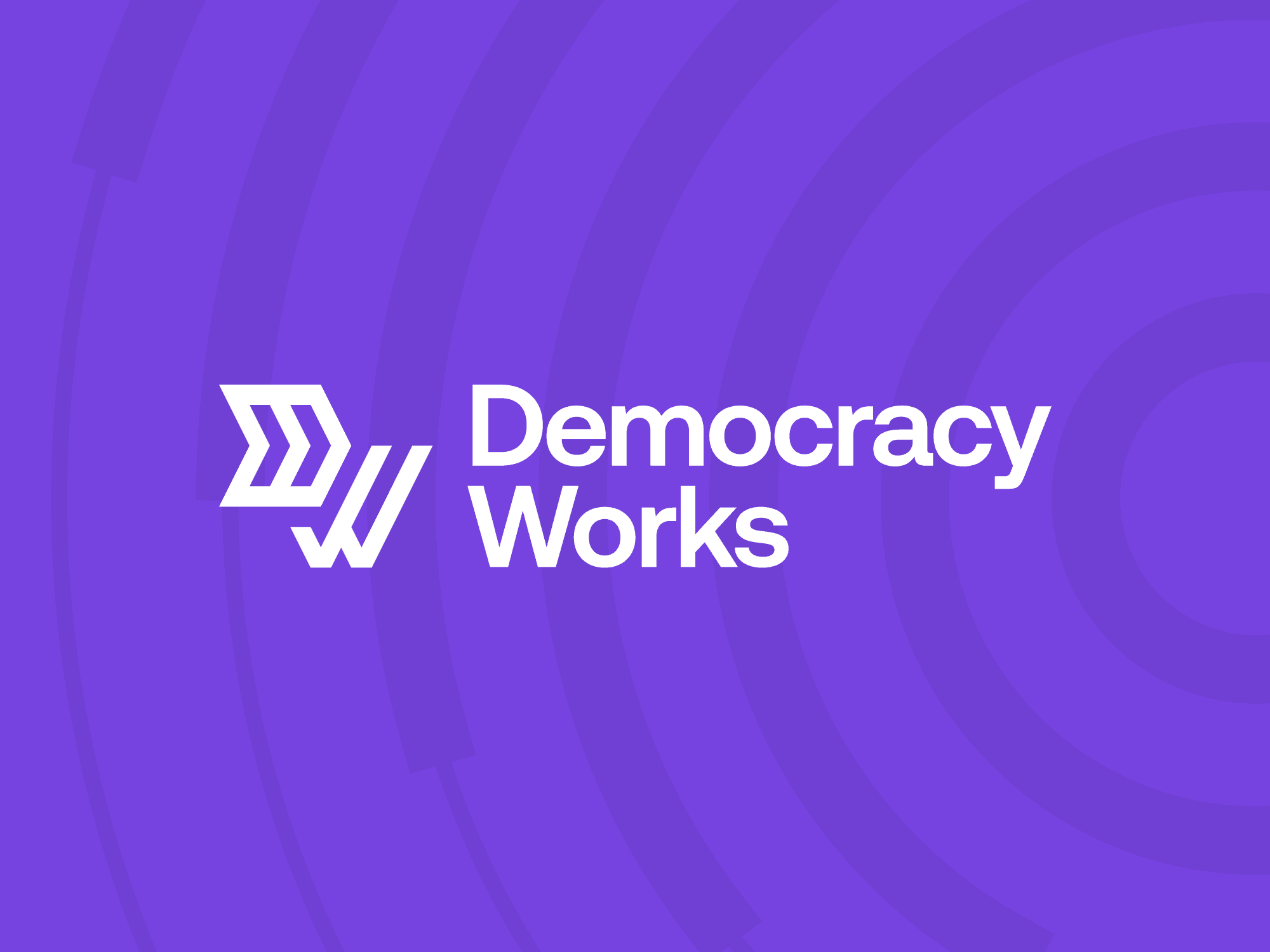
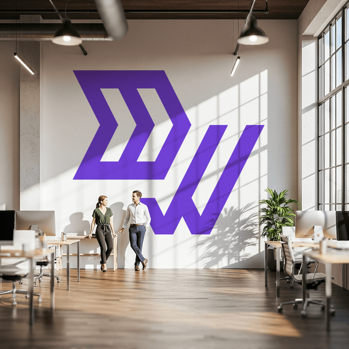
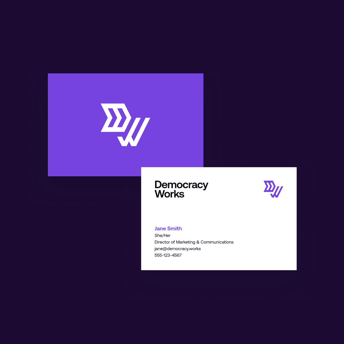
The logo is built around a custom D+W monogram that reflects the organization’s role in supporting voters with reliable election information. The D is formed with forward-moving arrows that convey progress and innovation, while the W is constructed from two checkmarks that reference voting, action, and trust.
Visibility at scale.
Democracy Works now heads into every election with a brand that matches the impact of the work. Leadership shares a clearer sense of who the organization is. Partners and funders have a story to carry. The quiet operator behind some of the country’s most trusted election information is visible at a scale it has been operating at all along.
From the client
“Chris has a rare ability to push his clients to aspire for greatness while keeping the work grounded and practical. He brought an exceptional level of thoughtfulness and professionalism to our brand project. What impressed me most was his commitment to truly understanding our brand ecosystem before putting pen to paper. He asked the right questions and challenged us to think more strategically about our identity and positioning.
The design work Chris delivered exceeded our expectations in every way. He ran a collaborative and thorough creative feedback process that ensured we didn’t just get something that looked great, but something that would serve both our immediate needs and long-term vision.”
— Brenda McNary, Director of Marketing & Communications, Democracy Works
Explore more world building.

Interested in what a project like this could look like for your organization? Let’s talk about it.
Get In Touch


